I’ve been trying to use Seatable where ever possible when handling data (I’m a UX designer and researcher working in open source software) - usually survey data, web analytic data, etc.
One feature I feel missing from Seatable is some fundamental data visualisation plugin. The map plugin is great for visualising data in terms of geographic representation, but I then need to visualise in terms of breakdowns also.
Is there any intention to create a plugin or natively support some visualisations?
welcome to the SeaTable Forum! And thanks for your kind words. We appreciate that you are enjoying using SeaTable.
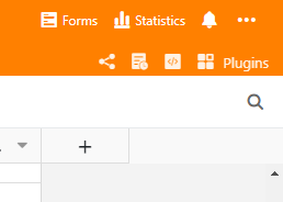
As for fundamental data visualisation, I’m not sure if you have already checked out the Statistics function? The entry is on the top right corner.
With the statistics function, you can create visualisations like histogram, line diagram and pie charts. More information to this topic are in the SeaTable User’s Manual - Statistics.
Did you mean this? Or did you mean something else? Let us know
Moments before I got the notification of your reply, I was playing around in the UI and saw the Statistics function. I had seen it before but did not associate it with graphs, or visualisation!
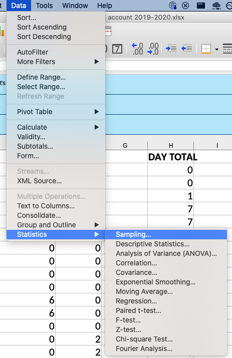
I more thought it was similar to the functions in LibreOffice: