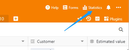
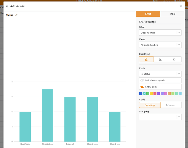
I’m not sure if any kind of feature is planned where we can create graphs and charts of our data?
In the absence of this feature I’m wondering if anyone has successfully used products like Redash or Metabase to link Seatable data to something visual? If so how difficult was this to do? I’d love to hear advice from people that have tried this or other similar services that people have tried. Cheers.


